Cascading style sheets! I thought this would be a good time to review some CSS essentials (tbh: I was advised to review my CSS and design for a phone screen this week, and I moved on to the next round!). CSS allows us to specify the presentation and design of web pages separately from the content. It defines how browsers present our HTML in terms of look and feel.
I found this interesting resource, CSS Guidelines, which serves to help keep stylesheets maintainable and scalable by providing recommendations. The first of which is to develop a styleguide to set the standard for code quality and consistency across a codebase.
The basic syntax format of CSS is as follows: Selector { property: value; }
Selectors
- ID selector
p#intro { color: red; }p element with ID of “intro” (note- IDs should be unique, and you should not assign multiple IDs to the same element) - Class selector
p.alert { color: red; }p element class of “alert” - Compound Selector
h1, h2 { color: red; }all h1 and h2 elementsCombinators:
- Descendent
article p { color: red; }all p elements within article - Immediate children
article > p { color: red; }p tags one level down from article - Adjacent Sibling
h3 + p { color: red; }p directly following h3 - General sibling
h3 ~ p { color: red; }all p elements directly following h3 - Universal
* { color: red; } - Attribute
input[type=”text”] { color: red; }all input elements with type attribute of “text” - Pseudo class
a:link {}ora:visited{}actions
External, Internal and Inline CSS
- An external stylesheet is a separate .css file that we can link to our pages by including
<link rel=”stylesheet” type=”text/css” href=”style.css”>in the head of our HTML file. One of its biggest advantages is separation of concerns- so you can make a single change to apply to all linked pages. It can be applied to multiple web pages, but it must be loaded each time. - An internal stylesheet is CSS for the page included in a
<style>tag within the head of the HTML file. The rules will only apply to that specific page. - Inline styles use a
styleattribute within a particular HTML tag to affect that particular tag only. For example:<p style="color: blue;">Hello!</p>
Specificity
CSS selector specificity comes into play when there are two or more conflicting CSS declarations that are pointing to the same element. Specificity describes a hierarchy that governs which rule will take precedent.
Here is the hierarchy from most to least specific:
- Inline style
- ID
- Class
- Attributes
- Elements
In CSS, more specificity = more authority. If two conflicting CSS declarations have equal specificity, the latest one takes precedence. More info about specificity calculations here.
CSS Sprites
Sprites are large images containing a set of small images. Using sprites helps pages to load faster and cuts down on HTTP requests. More info here.
Floats
- flowing text around an image- refers to the way an element floats to one side and down
- floating an element makes it a block box
- always set a width of floated items, otherwise it will fill its containing block horizontally, allowing no space to other content to flow around it
- not possible to float in the center
- drawback- relying on browsers to consistently interpret layout
- elements following a floated element will wrap around it by default- unless cleared
Example of clearfix hack:
(prevents parents with floating children from collapsing - see visual example here)
.clearfix::after {
  content: "";
  clear: both;
  display: table;
}
Box Model
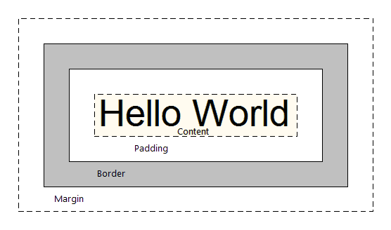
Can’t forget the trusty old box model! Margin/Border/Padding/Content

Display
So many options. Here are a few I’ve seen most commonly in the wild:
- inline - Displays as an inline element (like
<span>,<a>or<img>) with no line break after. Any height, width and margin properties will have no effect. - block - Starts on a new line and takes up the whole width (like
<p>) - inline-block - Inline level block container! The element is formatted inline, but you can apply height, width, and margin values.
Position
- static - default- not affected by the top, bottom, left and right properties. margins can overlap
- relative - can adjust with top, bottom , left tand right
- fixed - stays in same place even if page is scrolled
- absolute - relative to nearest positioned ancestor
- sticky - based on scroll position- sticks like fixed when it reaches top, right bottom or left property
Overlap
z-index – higher value will appear above other elements
Responsive layout
Design and development based on size of screen, platform, orientation – flexible layouts, grids images, media queries
Graceful degradation- modern-first approach to create responsive websites designed to function the best on newer browsers, but still provide compatibility for older browsers
Mobile- up – designed first to fit on mobile devices, and the scaled up for larger screens
CSS media query can adjust viewport depending on screen size (different devices)
examples of CSS media queries
@media only screen and (max-width: 1024px) { #wrapper { width: 90%; } }
@media all and (min-width: 480px) and (max-width: 1024px) { nav { font-size: 1.5em; } }
media @screen- the browser itentifies itself in the screen category- roughly desktop-class (as opposed to older mobile phone browsers- but note that iPhone and other smartphone browsers identify themselves as screens…), or a screenreader (which displays the page on-screen, rather than printing it)min-widthandmax-widthspecifies the width of the browser window (including the scroll bar) in CSS pixels, not device pixels.

Thanks for reading!!!